Market concentration for Creation & Production

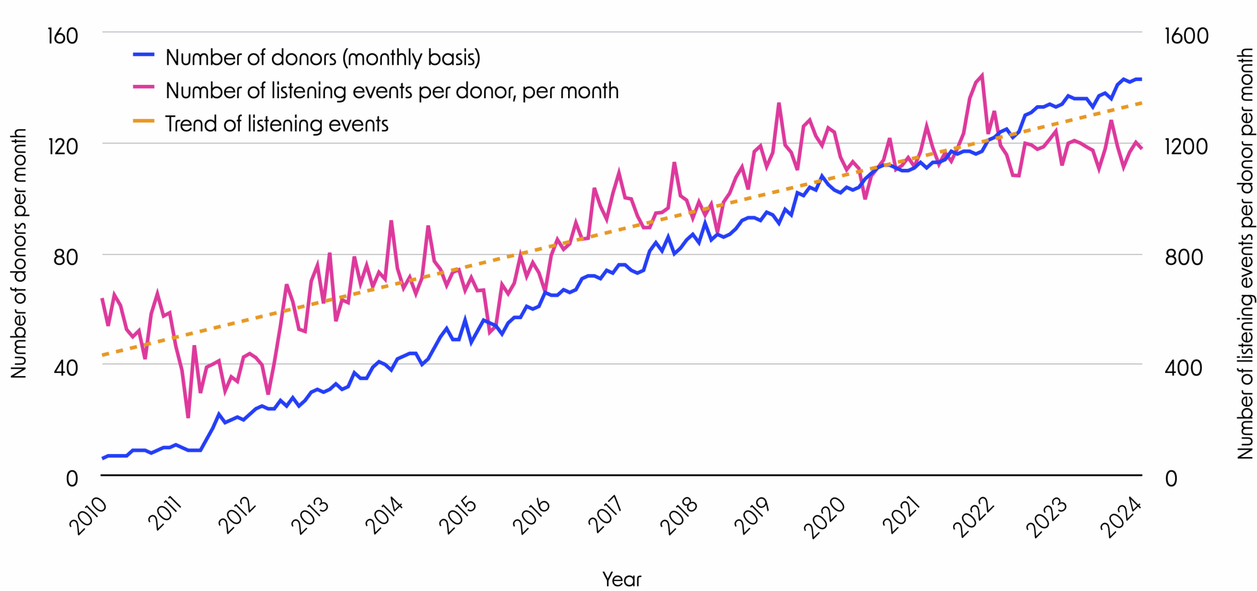
Since 2010, more and more donors have started to use streaming services. This is shown in the blue line. As only active listening is registered, we see some fluctuations; when a donor has no listening sessions within a month, it results in a dip in the blue line.
The pink line shows the average number of tracks listened to per month per user. It increases steadily, indicating that donors who adopted streaming services tended to listen more frequently over time. The orange trend-line summarizes our donors' growing use of the streaming services.
The plot shows donation data until March 18, 2024.
Since 2010 more and more donors have started to use streaming services. This is shown in the blue line. As only active listening is registered, we see some fluctuations. When a donor has no listening sessions within a month, we see a dip in the blue line.
The pink line shows the average number of tracks listened to per month per user. It increases steadily, indicating that donors who adopted streaming services tended to listen more frequently over time. The orange trend-line summarises our donors' growing use of the streaming services.
The plot shows donation data until March 18, 2024.
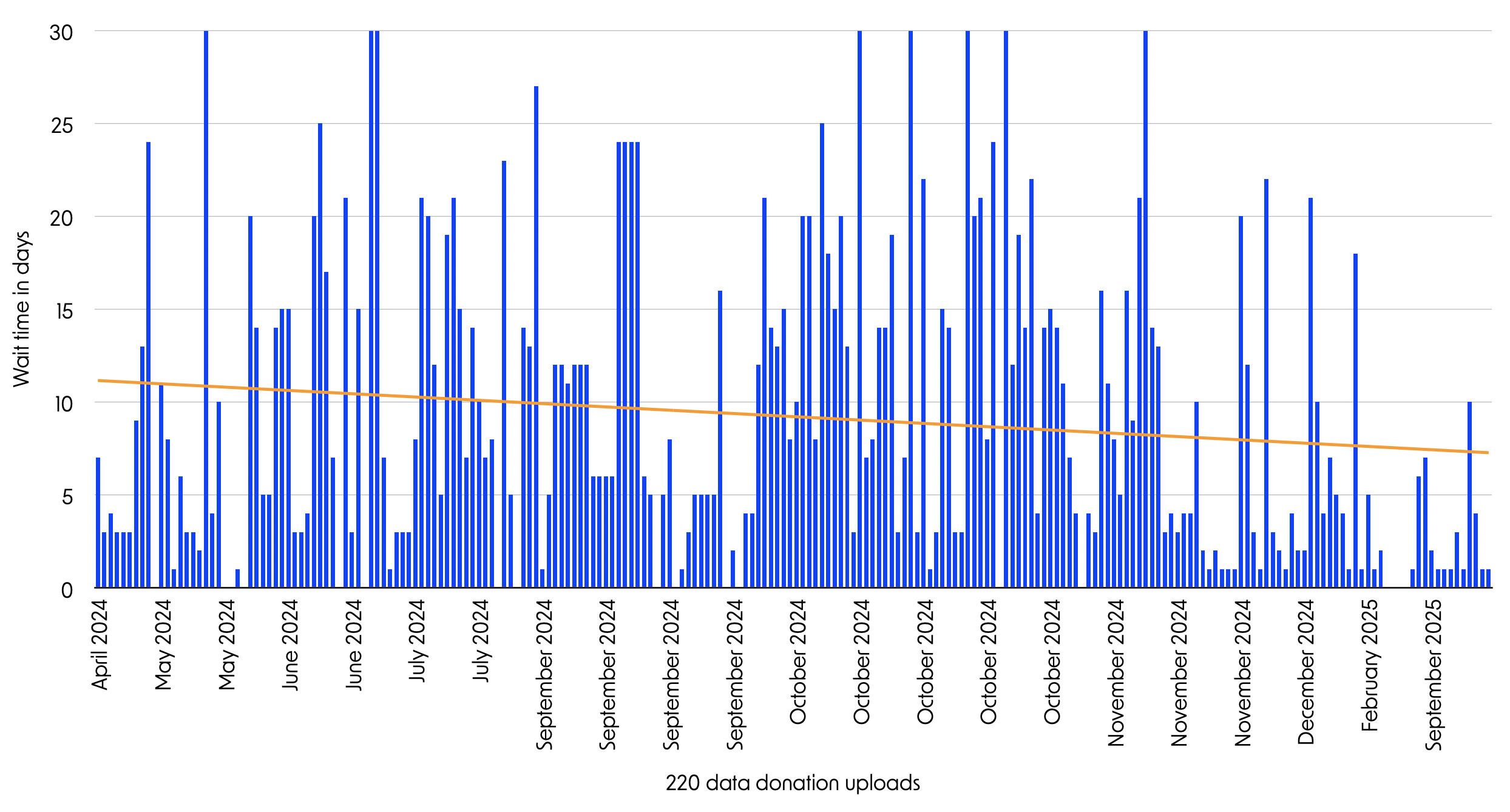
The user data donation process was slowed down by the streaming services. Before donating their streaming history data, our donors had to request data from their streaming platform and wait.
While Apple and Google (YouTube) offered the data within a few days, Spotify needed up to 30 days to deliver. In this plot, we see donors' self-reported waiting time.
Most donations came from Spotify users. Over the data collection period, Spotify's announced 30-day waiting time has declined, as shown with the orange trend-line. It suggests that Spotify has become more efficient in providing requested data.
The graph represents self-reported data from donors on how long they had to wait before they received their streaming history data after requesting it. The time varied between 1–30 days and was quite irregular; however, there was an overall decline in waiting time. Especially around the end of 2024 and throughout 2025, the majority of the requests took 5 days or less to process.
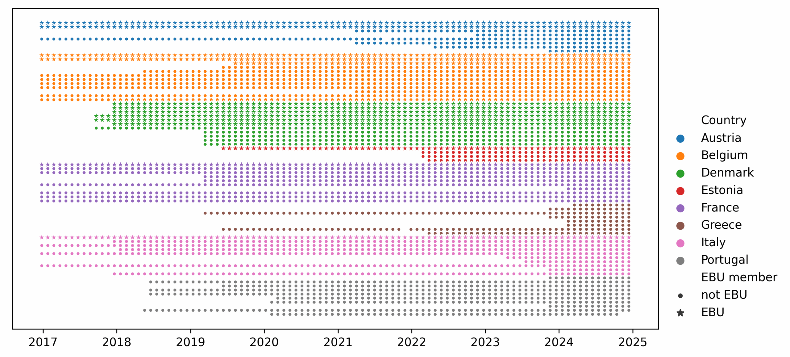
Radio is a curated precursor to algorithmic streaming of music. As such, it is interesting to analyze similarities and differences between the two media. We selected 14 public service radio channels ("EBU") and 59 commercial radio channels from the eight Fair MusE consortium countries to analyze playlist diversity over time.
Each row on the graph represents a radio station, and the range of dots represents its broadcasting timeline. Contrary to commercial radios, public service channels typically have obligations to present diverse music. Our dataset comprises more than 50.9 million airplays.
Some radios have been operating for over 8 years, while others began much more recently. All radios were broadcasting during this project; only one selected Portuguese channel ceased to operate before 2025. One dot is one month of broadcasting; if the symbol is a star, this means that the radio is an EBU member. EBU stands for European Broadcasting Union, an alliance of public service media organisations. Some public service channels have special obligations to promote diversity, e.g., in music.
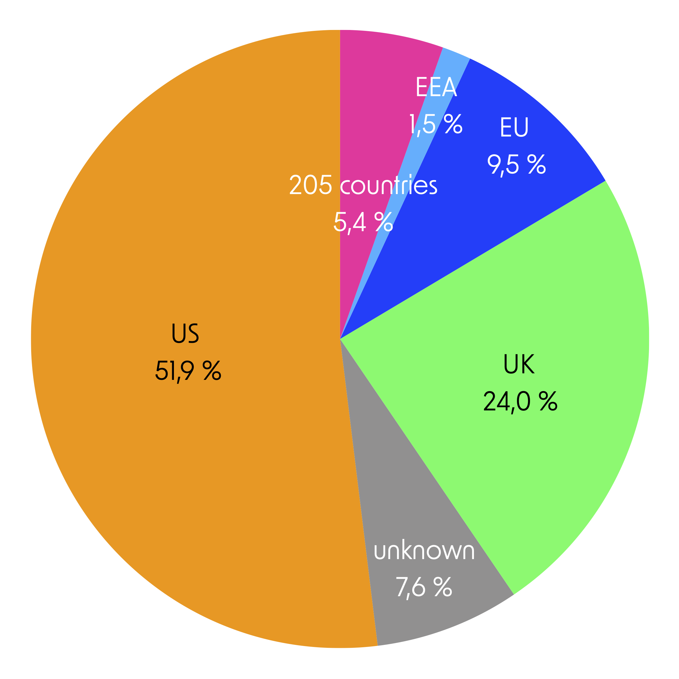
More than half of our donors' listening is created by artists from the US. The UK holds a prominent second position. Only 10% of the music has been created by artists in the EU. Our donors, however, have an interest in artists from a very wide range of other countries—205 to be precise. Finally, for 8% of the listening events, our data source provides no information on the artist's country.
If we look at independent labels organized in the umbrella organization "IMPALA", the pattern of country dominance (here in terms of label country) is mirrored, but with interesting exceptions (number of listening events): UK: 8,263, Denmark: 6,295, Netherlands: 3,394, USA: 2,683, Sweden: 1,476, Germany: 1,443, Georgia: 1,335, Italy: 1,053, Finland: 920, Norway: 568, Spain: 229, Australia: 161, Austria: 137, France: 90, Hungary: 47, Greece: 38, and Belgium: 21 listening events.
Determining an artist's country is difficult. We use an external data source: MusicBrainz. An artist's country is defined by MusicBrainz as "the area with which an artist is primarily identified with. It is often, but not always, its birth/formation country." (https://musicbrainz.org/doc/Artist). The principles or processes for assigning "areas" to artists are not available to us; they are simply provided in the streaming data. The calculation is thus our best effort based on the available data.
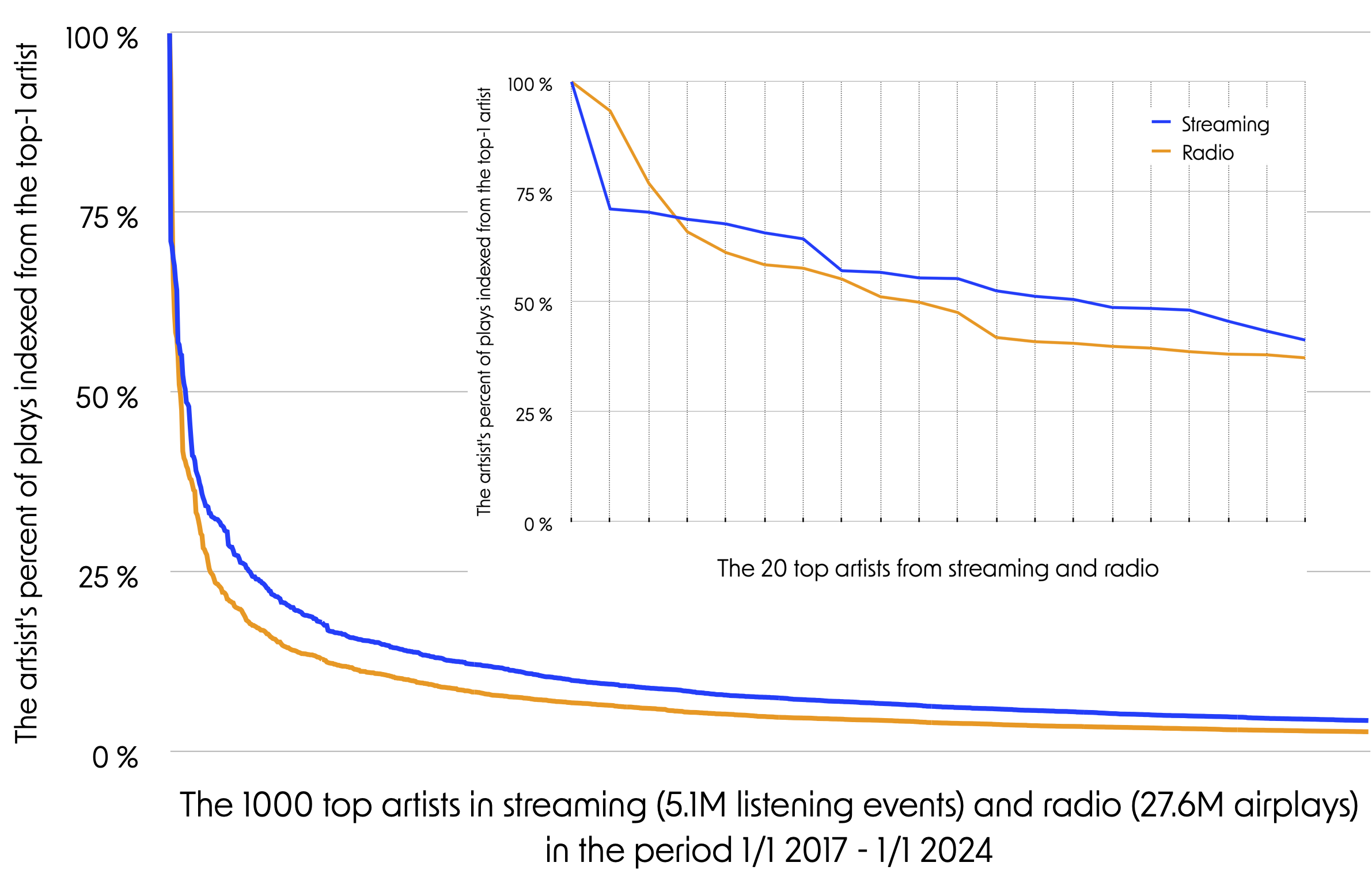
The two plots show the distribution of airplay and listening events for the Top-1,000 and Top-20 artists. This means that the number of plays of each of the artists in the top 1,000 or top 20 is compared to that of the first artist.
The orange line that represents artists being played in the radio takes a more sudden "dive" than the blue line that represents the streaming artists. This suggests that the radio's less popular artists receive less play time compared to streaming data. In other words, our donors listen to a broader range of top artists. The inserted graph shows details for the Top-20 artists.
The percentage for each artist has been calculated by dividing the number of airplays / listening events for the artist by the Top-1 artist for the period 1/1 2017 to 31/12 2024. We should note that the composition and ranking of top artists is different for streaming and radio playlists, respectively. We should also critically consider the comparability between the two datasets, the listening history and the playlist data: they cover different countries and different timespans.
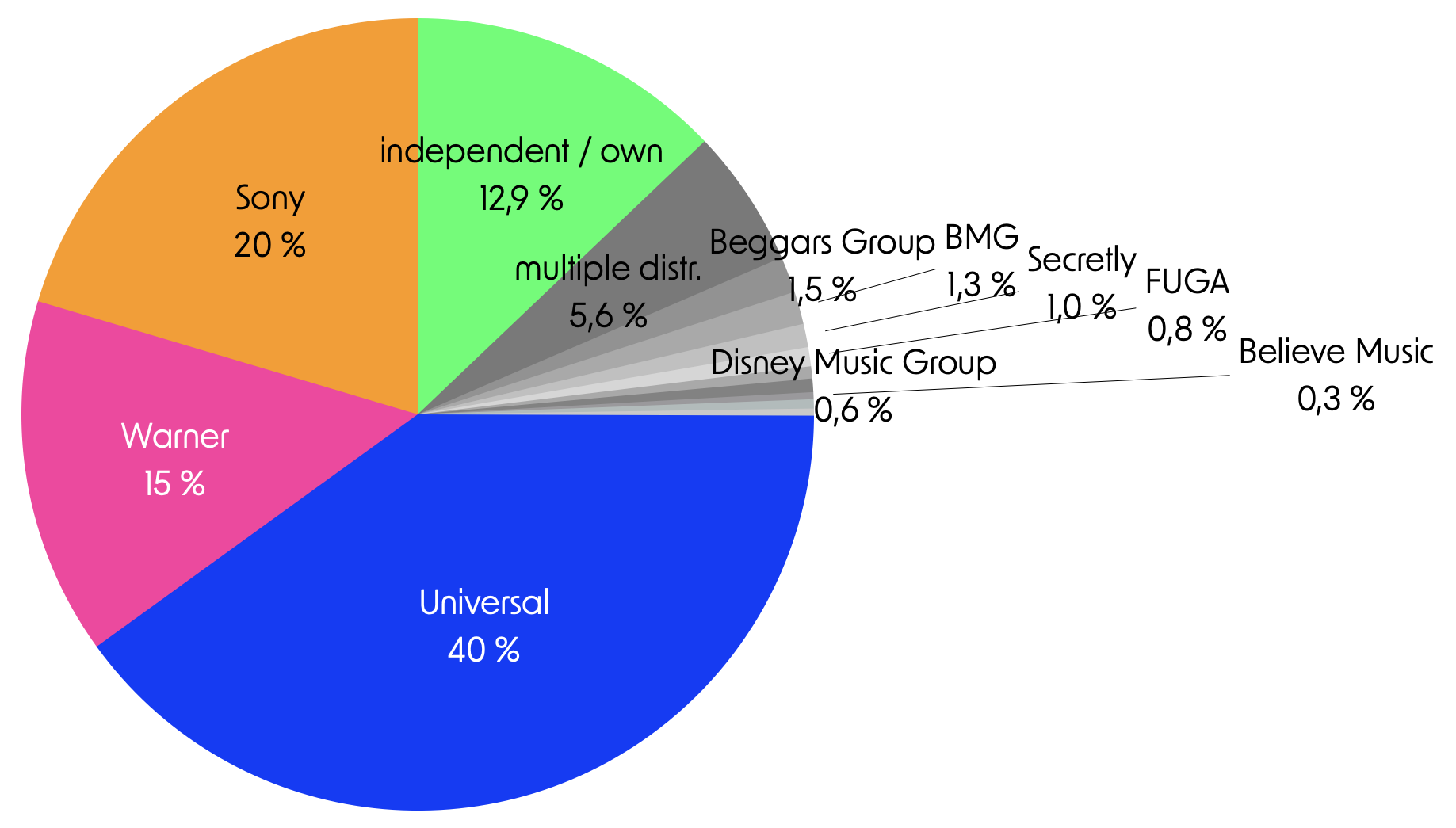
Among the top-100 labels, the three major labels (Universal, Warner and Sony) have a large share of our donors' streaming. "Self-released" and independent labels have however 12,9 % of all listening events.
The question is interesting as big labels may have a better position in negotiating exposure in streaming services' algorithmic recommendations than smaller, independent labels.
Identifying who has control over distribution is, however, difficult. Many small labels are owned by one of the big three or are dependent on their distribution. Among the top-100 labels, Universal controls 34 labels, Sony 10 and Warner 11.
For the top-100 labels we have manually looked up the parent company or distributor. In case of mixed ownership and / or several distribution channels, we have used the category 'multiple'. Counted as smaller labels are: Redeye Distribution, RED Distribution, Believe Music, Secretly and FUGA.
We have examined the top-100 labels, but our donors listen to music from more than 10000 labels. The labels for which we have not examined ownership stand for around 66% of the listening. A more precise calculation of label dominance should include these many labels that may belong to one of the big three labels.
A sum of 2,76% of all the streaming listening can be attributed to 135 of 2352 labels that are members of IMPALA, a non-profit supporting smaller music companies and artists.
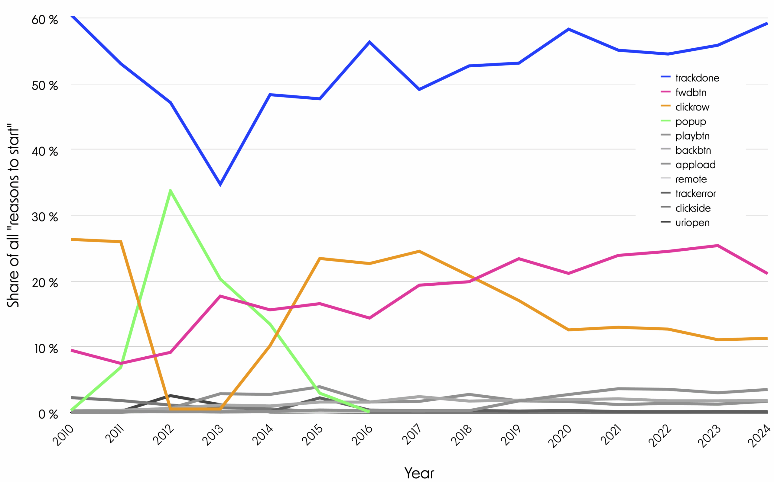
Spotify's data includes the category: "reason to start". This enables us to examine whether a track was actively chosen by a user or played automatically. Over the last 10 years, the share of "trackdone" (auto-play) has grown while the share of "clickrow" (active choice) has declined. Increasingly, also "fwdbtn" (the "Forward" button) is being pressed, indicating dissatisfaction with the auto-play. Since "trackdone" accounts for the majority of listening events, we conclude that most listening is passive.
In the early years, "pop-up" was a dominant "reason to Start". It has not been possible for us determine with certainty what "pop-up" implies. Internet sources speculate that it was a marketing feature, suggesting tracks to users.
This graph is based only on Spotify data; each song in the streaming history is labeled with one of eleven reasons for starting. All eleven reasons for a track starting are displayed on the graph based on their proportion each year. The four main reasons: "trackdone", "fwdbtn", "clickrow", and "popup" are highlighted. Reasons to start which require the user to interact with the platform, such as "fwdbtn" or "clickrow", are considered as active. Automatic playing of a queue, album, playlist, etc., as indicated by "trackdone", is considered as passive. In addition to "trackdone" being the most dominant, a large share of passivity on streaming platform algorithms is perceived by users, as explored in the section "Views on the Role of Platform-Curated Playlists in Music Streaming".
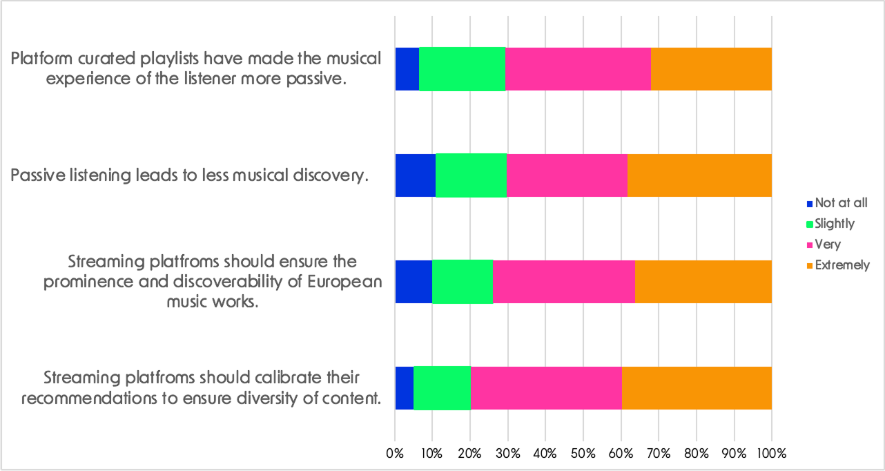
Current platform-curated playlists and recommendations act as a barrier to music discovery and lead to more passive and less diverse listening. This statement is a summary of the majority view on the four statements presented in the graph, reflecting a lack of trust in autonomous decision making and a desire for external implementation of streaming diversity.
Over 2/3 of respondents consistently agreed "extremely" or "very" with the four statements on passive listening. This high level of agreement reached almost 80% for the statement suggesting that platforms should calibrate their recommendations to ensure diversity of content. For more information, please refer to the Deliverable D3.2.
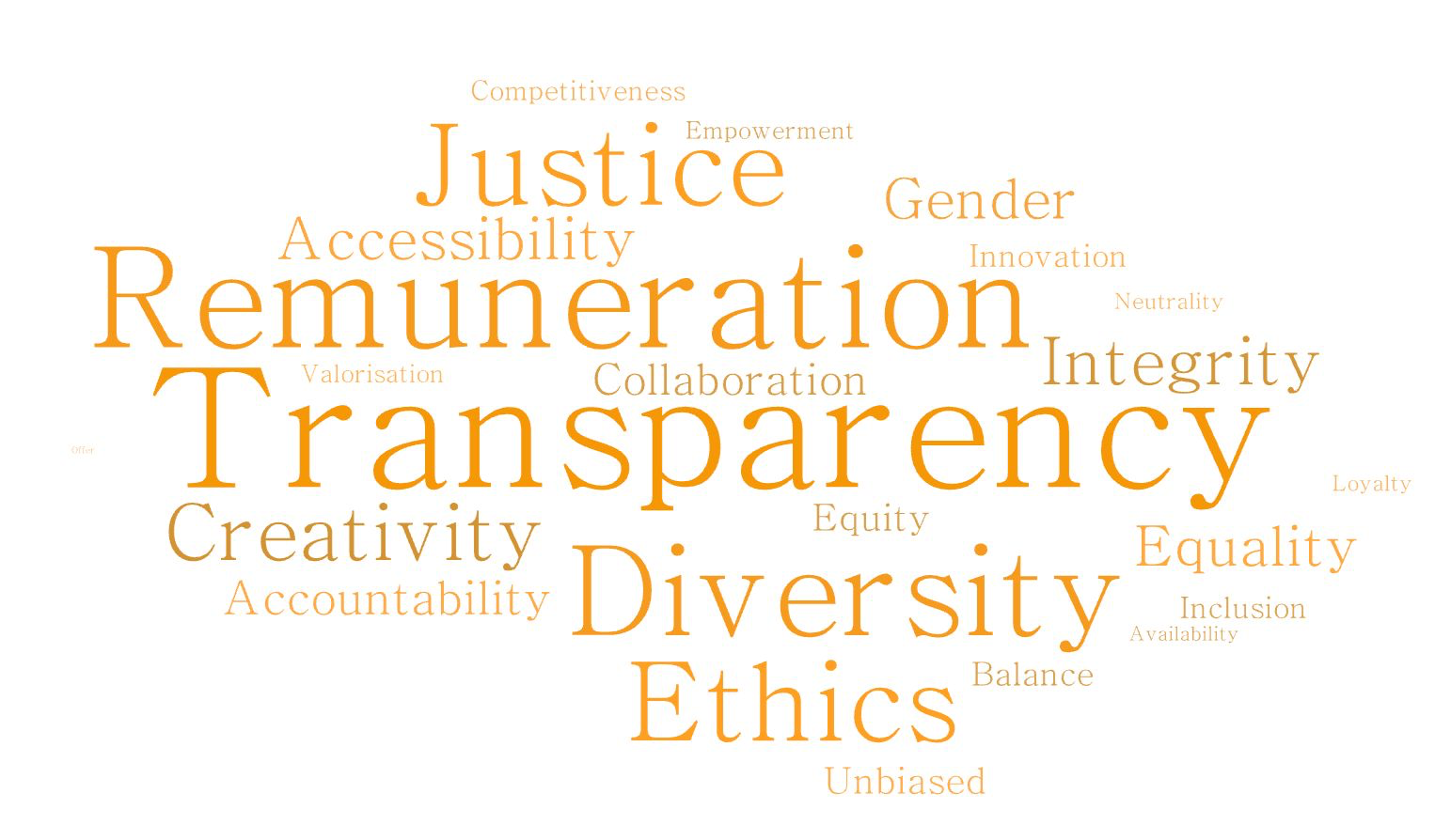
Respondents were asked which terms they associate with fairness in the music industry. 353 respondents selected up to three terms from a list of 23 options. Highlighted in the wordcloud, the terms transparency (58.9%), remuneration (52.7%), and diversity (45.6%) were the most prominent answers.
For more information, please refer to the Deliverable D3.2.
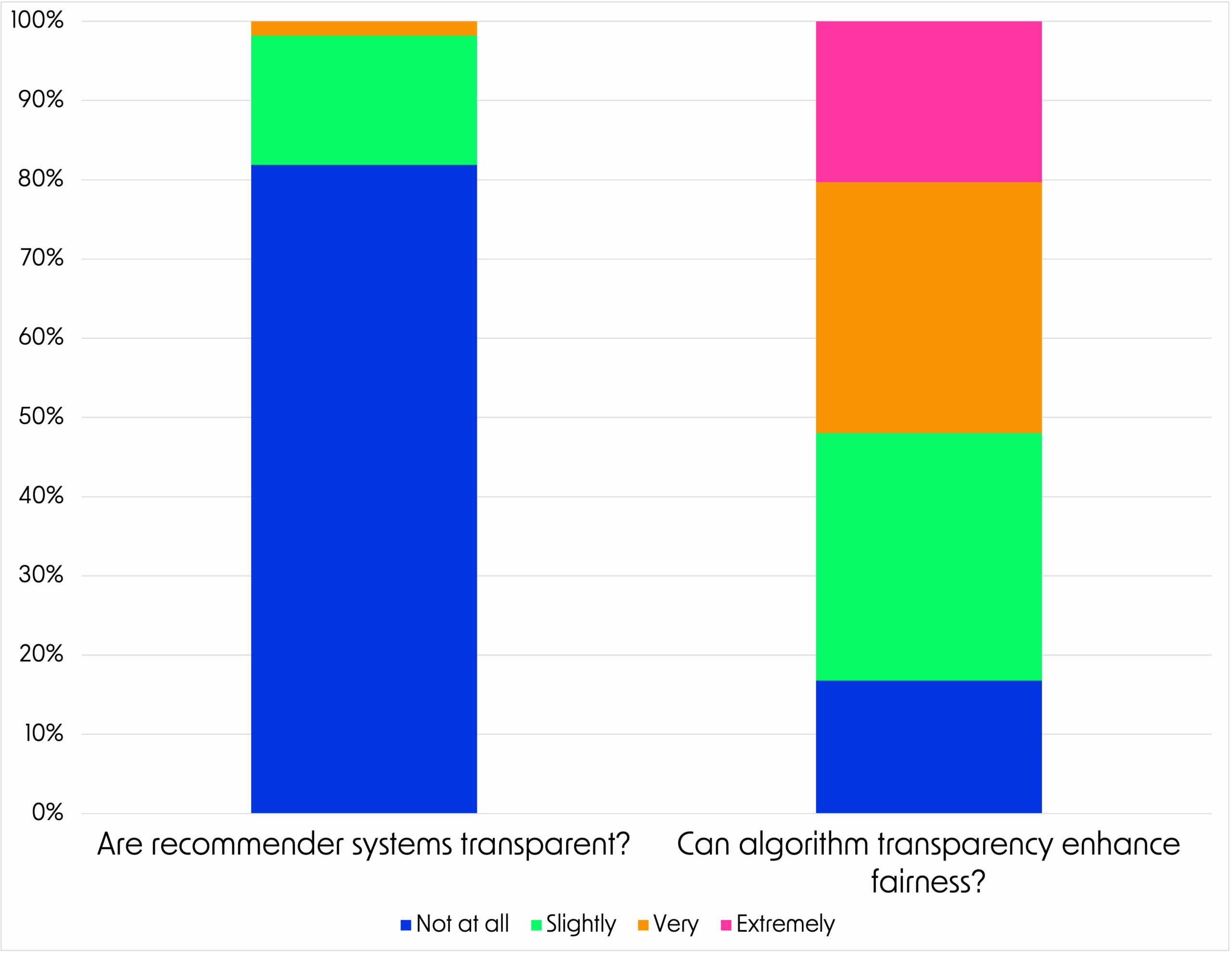
The survey results underscore significant concerns about the lack of transparency. A striking 98.2% of respondents perceived recommender systems as ‘not transparent at all’ or ‘slightly transparent’, with only a negligible 1.8% considering them ‘very transparent’. The potential for greater transparency to improve fairness elicited mixed reactions among respondents. While 31% believed that better access to data about recommender systems could ‘slightly’ or improve fairness ‘very’ much, 20% were more optimistic, choosing ‘extremely’, while 17% felt it would make no difference (‘not at all’).
For more information, please refer to the Deliverable D3.2.
The survey results underscore significant concerns about the lack of transparency. A striking 98.2% of respondents perceived recommender systems as ‘not transparent at all’ or ‘slightly transparent’, with only a negligible 1.8% considering them ‘very transparent’.
The potential for greater transparency to improve fairness elicited mixed reactions among respondents. While 31% believed that better access to data about recommender systems could ‘slightly’ or improve fairness ‘very’ much, 20% were more optimistic, choosing ‘extremely’, while 17% felt it would make no difference (‘not at all’).
For more information, please refer to the Deliverable D3.2.
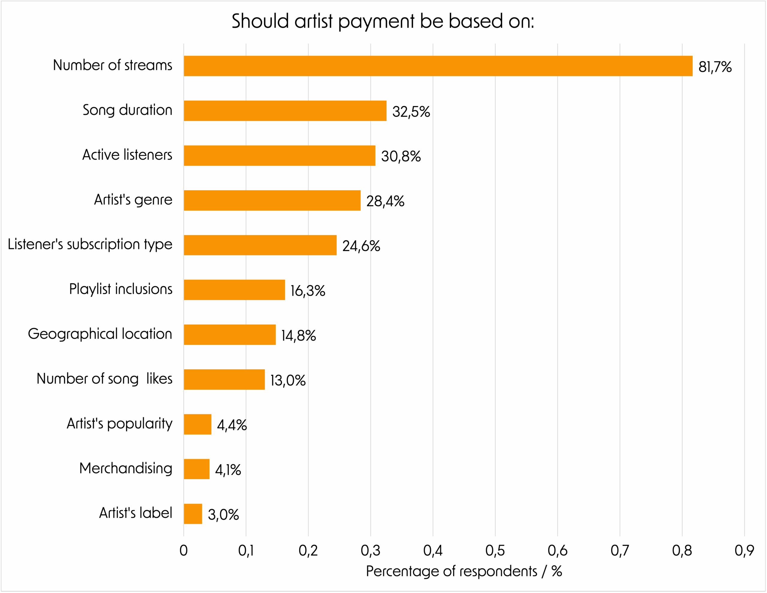
The majority (81.7%) of respondents in the survey favoured a payment model based on the song’s number of streams, indicating a preference for a system where "the more streams a song gets, the higher the payment". Interestingly, the second most selected option was payment relative to the song’s duration, with 32.5% favouring longer songs receiving higher compensation. This suggests dissatisfaction with the current remuneration model, where payments are triggered after just 30 seconds of play, disproportionately impacting genres like jazz and classical music that often feature longer tracks.
Multiple answers could be selected by respondents. Refer to Deliverable D3.2 for details.
The majority (81.7%) of respondents in the survey favoured a payment model based on the song’s number of streams, indicating a preference for a system where "the more streams a song gets, the higher the payment".
Interestingly, the second most selected option was payment relative to the song’s duration, with 32.5% favouring longer songs receiving higher compensation. This suggests dissatisfaction with the current remuneration model, where payments are triggered after just 30 seconds of play, disproportionately impacting genres like jazz and classical music that often feature longer tracks.
Multiple answers could be selected by respondents. Refer to Deliverable D3.2 for details.
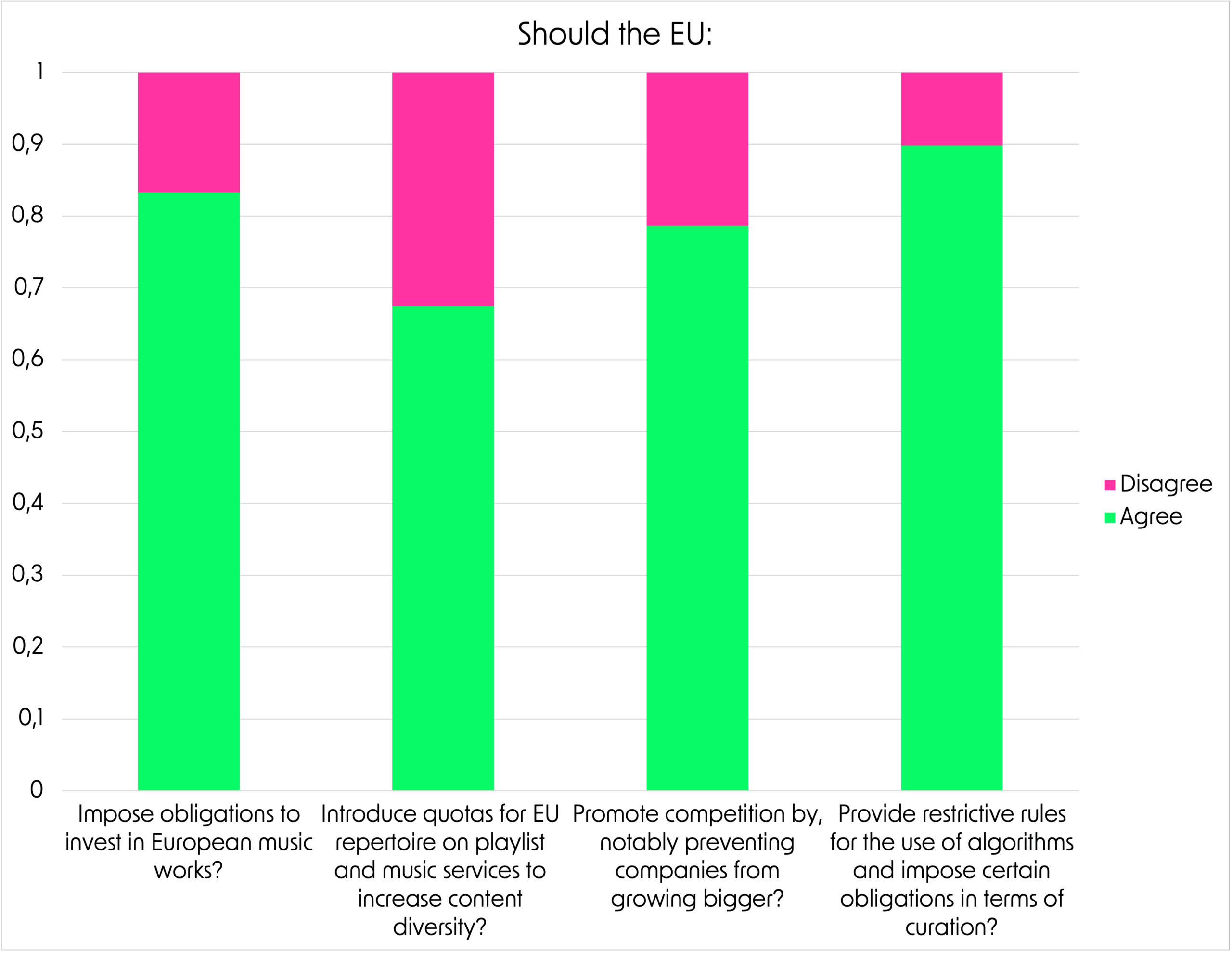
The majority of responses indicate that, across all categories, greater EU involvement and proactivity would be welcome. Nearly 90% of respondents agree that the EU should impose restrictions on music recommender algorithms, suggesting a sense of inadequacy or mistrust in the current system.
For more information, please refer to the Deliverable D3.2.
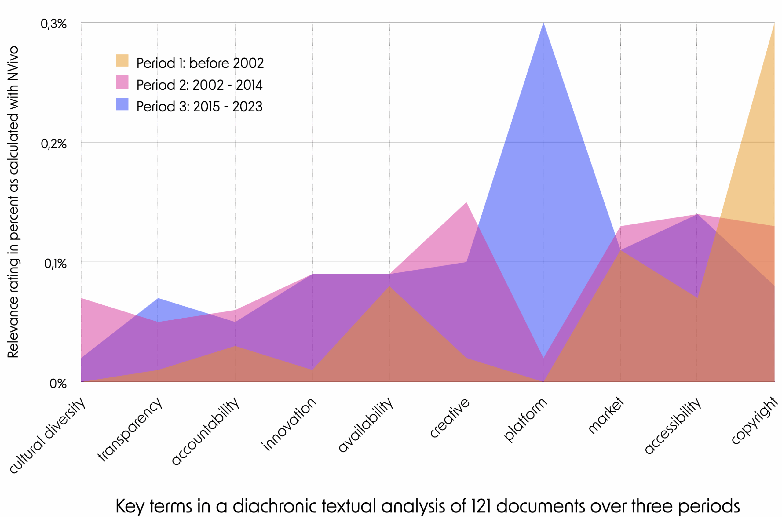
In the early 2000s, copyright was frequently framed as an issue of fairness in the music industry's EU legislative documentation, reflecting its relevance in an increasingly digitalized environment. Between 2002 and 2015, several new key terms gained prominence, including a growing emphasis on creativity and innovation, alongside the emergence of new themes such as platforms and cultural diversity. From 2015 to the present, platforms have become increasingly central to EU policy discussions, as has their popularity as a means through which music is accessed, consumed, and discovered.
We visualise an in-depth diachronic textual analysis of the EU institutions’ legislative acts and policy instruments related to EU policy on the music sector since the early 1990s. The analysis carried out is based on 121 documents issued by the European Commission (the Commission), the European Parliament, the Council of the European Union (the Council), as well as the European Parliament and the Council as co-legislators. NVivo is used as a tool to quantitatively map the occurrences of specific keywords in the documents (Hilal and Alabri 2013). The results are subsequently presented in terms of a relevance rating generated by NVivo and expressed as percentages. In all, 162 relevant keywords were chosen to break the text materials into small chunks of information; targeted textual research was then conducted across the entire dataset, resulting in each keyword being assigned numerical data. These findings should not be used without appropriate contextualisation. We therefore strongly recommend consulting the full results and conclusions in the Fair MusE report D2.1.
In the early 2000s, copyright was frequently framed as an issue of fairness in the music industry's EU legislative documentation, reflecting its relevance in an increasingly digitalized environment.
Between 2002 and 2015, several new key terms gained prominence, including a growing emphasis on creativity and innovation, alongside the emergence of new themes such as platforms and cultural diversity. From 2015 to the present, platforms have become increasingly central to EU policy discussions, as has their popularity as a means through which music is accessed, consumed, and discovered.
We visualise an in-depth diachronic textual analysis of the EU institutions’ legislative acts and policy instruments related to EU policy on the music sector since the early 1990s. The analysis carried out is based on 121 documents issued by the European Commission (the Commission), the European Parliament, the Council of the European Union (the Council), as well as the European Parliament and the Council as co-legislators.
NVivo is used as a tool to quantitatively map the occurrences of specific keywords in the documents (Hilal and Alabri 2013). The results are subsequently presented in terms of a relevance rating generated by NVivo and expressed as percentages. In all, 162 relevant keywords were chosen to break the text materials into small chunks of information; targeted textual research was then conducted across the entire dataset, resulting in each keyword being assigned numerical data.
These findings should not be used without appropriate contextualisation. We therefore strongly recommend consulting the full results and conclusions in the Fair MusE report D2.1.